The Polstar logo, wordmark, and symbol are vital in conveying our brand identity. Each has been carefully designed for visual harmony and should remain untouched in terms of alterations, modifications, or redesigns. Given that these elements are easily recognizable and stand out as important brand assets, it's crucial to consistently apply them. By following these simple guidelines, you'll be able to make the most of our logo, wordmark, and symbol to effectively communicate the essence of the Polstar brand.
The Polstar Logo
Here we have the Polstar logo. It serves as our main visual identifier and is the top pick when selecting a graphical element to embody the essence of the Polstar brand.
# 005598
The Polstar logo is composed of both a symbol and a wordmark. You have the flexibility to use these elements separately or combine them together.
# 005598
# 5C5C5C
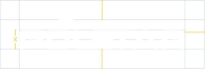
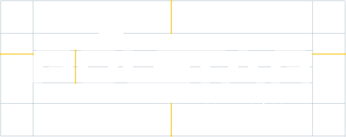
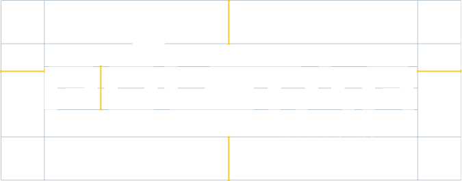
Logo Clearspace and Margins
When incorporating the Polstar logo into a design, it’s important to provide adequate space around it. Clear space is the designated area between the logo and surrounding graphic elements. Use the height of the capital letters in the wordmark as a guide for determining the clear space, denoted as the cap height (X). Additionally, make sure there’s a margin of X on all sides of the logo to maintain proper spacing.
Logo Color Standard
The logo should primarily appear in all blue, all white, or with a blue symbol and a gray wordmark, and vice versa. It should strictly avoid incorporating additional colors, yet it can be situated on any shade from the Polstar brand palette, except for placing a white logo on any of the palette’s light colors.
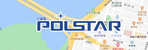
Feel free to position the logo on the map, ensuring that both the logo and wordmark possess white outlines.
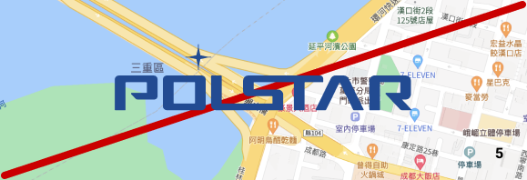
Incorrect Usage of the Logo
Do not place the blue logo on dark backgrounds and the white logo on light backgrounds.
Do not manipulate the star emblem in a random manner, nor change the arrangement of elements within the logo.
Do not apply gradients, shadows, non-standard colors or other effects.
Do not stretch or alter the proportions of the logo.
Do not place the logo directly on backgrounds with non-solid colors.